
Philo shifted from a simple subscription product to a more complex lifecycle that included free entry, trials, bundles, and multiple upgrade paths. That evolution created more ways to grow the business, but it also fragmented how users experienced value. Upgrade flows became inconsistent, messaging broke across surfaces, and experimentation started introducing risk to the core subscription funnel. I stepped in to design a system that could unify how monetization shows up across the product, making it easier for users to understand what they’re getting while giving the business room to move fast without breaking the experience.
The Challenge
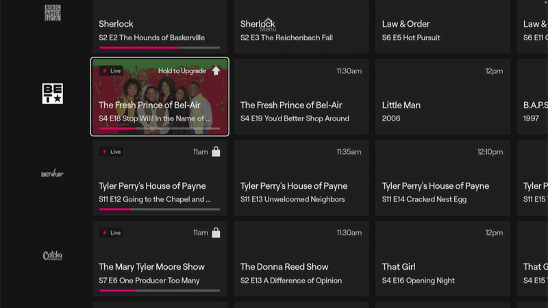
The unified experience work revealed a specific problem that users encountered regularly: they would be browsing FAST content, click on something that looked interesting, and suddenly find themselves on a premium show page or channel page with no context about why they were seeing it or what they should do. The documentation called it "jarring"—and that's exactly what it was.
This wasn't a small UX hiccup. It was a fundamental architecture problem. The product treated every surface as if users already understood Philo's structure—which channels were free, which required subscription, and what the difference even meant. But new users, especially those entering from FAST, had no mental model for this. They just clicked on content that looked good and ended up confused.
This case study is about how we fixed that jarring transition by introducing an interstitial upgrade page that showed value before gating, created clear upgrade moments, and laid the foundation for our Reverse Trial model.

The Problem
The issue showed up in multiple entry points. A user could click on a show in the guide and land on a premium show page. They could click on a channel in the All Channels view and suddenly be looking at subscription content. They could follow a deep link from marketing and arrive in a premium context with no explanation. In every case, the experience felt broken because the behavior didn't match the expectation.
The root cause was that Philo had designed these surfaces for credentialed, paying users—people who already understood the product structure. But now we were letting uncredentialed FAST users access these same URLs. Same UI, different user state, completely different needs. The paying user wants quick access to their content. The FAST user needs context about what they're looking at and why they should care.
We were also hitting users with dual paywalls in some flows. A user would encounter one paywall before entering account information, then see a different, updated paywall after creating their account. This wasn't intentional design—it was the accumulated result of different teams building different surfaces at different times without a unified model for how gating should work.
The Hypothesis
We believed that introducing an interstitial page—a clear upgrade moment that appeared between FAST and premium surfaces—would reduce the jarring transition by showing users what they were about to see and why it was valuable. The key insight was that users needed context before they needed access. If we could communicate value first, the gate wouldn't feel like an interruption—it would feel like a natural decision point.

Design Considerations
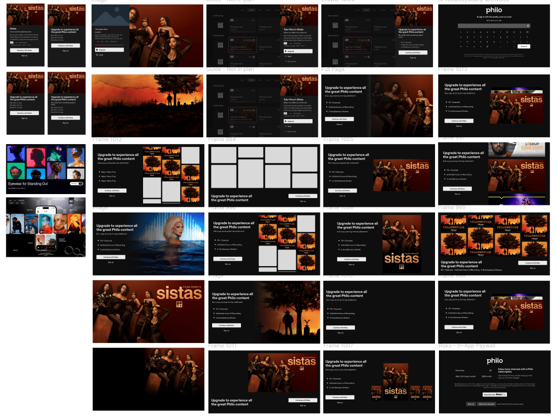
We designed three different interstitial page types, each optimized for different entry contexts. The goal was to show value, provide context, and offer clear next steps—all while maintaining the visual quality users expected from Philo.
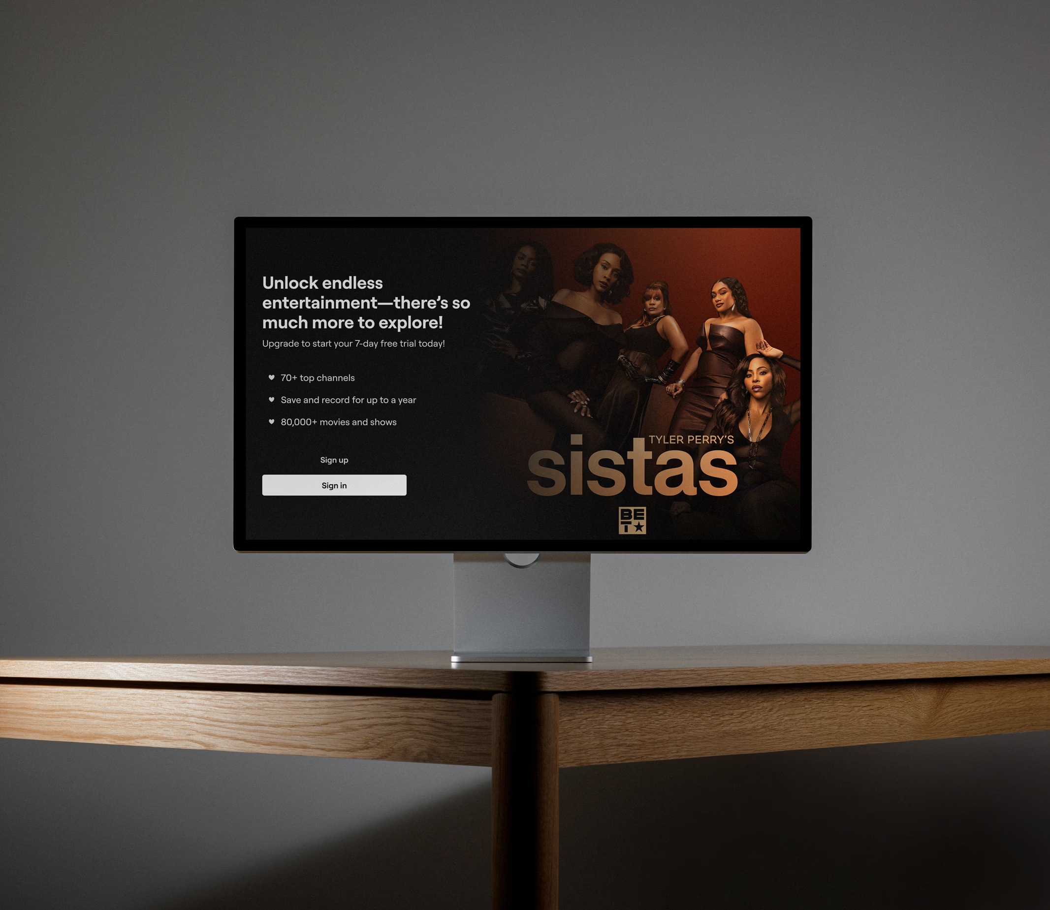
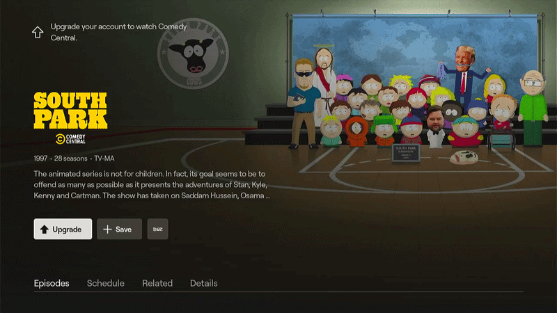
The first variant was Full Bleed - Show, used when users clicked on a specific show or movie. This version featured the show's hero image prominently, with a headline that communicated the premium value proposition, a brief description of what users would get with an upgrade, and clear CTAs for both signing up and signing in. The imagery was dynamic, pulling from the specific content the user had clicked on, making it feel personalized rather than generic.
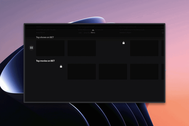
The second variant was Info Panel / Drawer, used when the user was browsing from the guide or when a drawer was already open in the interface. This version maintained the existing UI context but overlaid the upgrade messaging in the info panel, keeping users oriented in the product while still delivering the value communication. The advantage here was continuity—users didn't feel pulled out of their browsing experience entirely.
The third variant was Full Bleed - Channel, used when users clicked on a channel rather than a specific show. This version displayed a grid of content from that channel—popular shows, movies, and programming—to demonstrate content breadth. The headline could be either generic ("Upgrade to experience all the best content") or dynamic (incorporating the channel name), and the imagery cluster gave users a quick visual scan of what they'd get access to.
Each variant had trade-offs. The Show version gave us maximum space to communicate value and featured large, compelling imagery, but the copy had to work hard to differentiate the free trial from the free content users were already accessing. The Info Panel maintained context but had less space to make the case. The Channel version showed breadth but required users to parse multiple content tiles to understand the value.
We recommended starting with the Show and Channel variants since they covered the most common entry points, and we could test whether dynamic content (personalized to what users clicked) performed better than generic messaging about the overall platform value.
Implementation
One critical decision was whether to make the interstitial content dynamic—showing the specific show or channel the user clicked on—or generic—showing a curated collection of premium highlights. Dynamic content felt more personalized and directly relevant to the user's intent. If they clicked on a specific show, seeing that show's imagery reinforced that they were in the right place and just needed to unlock it.
But dynamic content also had risks. What if the show they clicked on wasn't particularly compelling in isolation? What if the channel they selected had weaker content than other premium options? Generic content gave us more control—we could always showcase our strongest premium offerings. But it also risked feeling disconnected from what the user actually wanted.
We decided to test both approaches. For shows with strong recognition and appeal, we'd use dynamic content to capitalize on existing interest. For channels with varied quality or less distinctive content, we'd use generic premium highlights. This gave us flexibility to optimize for conversion based on what the data showed actually worked.
Impact & Learnings
The interstitial pages became one of the first production validations of the unified experience framework. They required us to implement the value-first gating logic we'd designed—the idea that users should see what they're getting before we ask them to pay for it. This was a departure from traditional paywall patterns that gate first and explain later.
Implementing the interstitial pages also forced us to rationalize our gating moments. We had to decide: which surfaces should trigger the interstitial, and which should allow direct access? This wasn't arbitrary—it was based on the unified state model. FAST users could browse freely, but when they attempted to access premium content, that became an intentional upgrade moment rather than an accidental collision.
The interstitial pages also laid the foundation for Reverse Trial. Once we could show users premium value clearly and let them experience it contextually, we had the building blocks for a trial model that inverted the traditional approach. Instead of gating everything and making users imagine the value, we could show them everything and let them experience it directly before asking them to subscribe.
What This Demonstrates
This work taught us that context is everything in upgrade moments. Users don't mind being asked to pay—they mind being confused about what they're paying for and why. The interstitial pages gave us a way to communicate value at exactly the moment users needed that information. Instead of hitting a wall, they hit a clear decision point.
We also learned that dynamic content generally outperformed generic content when the underlying content was strong. Users who clicked on a popular show wanted to see that show's imagery and description. But for weaker content or unfamiliar channels, generic premium highlights worked better because they demonstrated the breadth of value rather than focusing on one potentially underwhelming example.
The dual paywall problem disappeared once we implemented the interstitial approach. By showing value first in a consistent format, we didn't need a second paywall after account creation—the decision point was clear before users committed to entering their information. This simplified the flow and reduced the jarring experience that the original documentation had called out.
The Bottom Line
This work shows how I think about user experience transitions. I don't just optimize surfaces—I optimize the moments between surfaces. The interstitial pages weren't about making prettier paywalls. They were about creating coherent transitions that matched user mental models and provided context when users needed it most.
I also think about how individual solutions connect to larger systems. The interstitial pages weren't a standalone feature—they were an implementation of the unified experience principles. They proved that value-first gating could work in production, and they created the foundation for more ambitious products like Reverse Trial. Every solution I design is designed to enable the next solution.

Made with love in Orange County, CA.
Built in Figma Sites (Beta)
© Selected Works / Eric Sin
2018—2026
Interstitial Upgrade Page
Philo’s monetization got messy fast.
I built a system that made upgrades clear, consistent, and scalable.
Philo shifted from a simple subscription product to a more complex lifecycle that included free entry, trials, bundles, and multiple upgrade paths. That evolution created more ways to grow the business, but it also fragmented how users experienced value. Upgrade flows became inconsistent, messaging broke across surfaces, and experimentation started introducing risk to the core subscription funnel. I stepped in to design a system that could unify how monetization shows up across the product, making it easier for users to understand what they’re getting while giving the business room to move fast without breaking the experience.
The Challenge
The unified experience work revealed a specific problem that users encountered regularly: they would be browsing FAST content, click on something that looked interesting, and suddenly find themselves on a premium show page or channel page with no context about why they were seeing it or what they should do. The documentation called it "jarring"—and that's exactly what it was.
This wasn't a small UX hiccup. It was a fundamental architecture problem. The product treated every surface as if users already understood Philo's structure—which channels were free, which required subscription, and what the difference even meant. But new users, especially those entering from FAST, had no mental model for this. They just clicked on content that looked good and ended up confused.
This case study is about how we fixed that jarring transition by introducing an interstitial upgrade page that showed value before gating, created clear upgrade moments, and laid the foundation for our Reverse Trial model.
The Problem
The issue showed up in multiple entry points. A user could click on a show in the guide and land on a premium show page. They could click on a channel in the All Channels view and suddenly be looking at subscription content. They could follow a deep link from marketing and arrive in a premium context with no explanation. In every case, the experience felt broken because the behavior didn't match the expectation.
The root cause was that Philo had designed these surfaces for credentialed, paying users—people who already understood the product structure. But now we were letting uncredentialed FAST users access these same URLs. Same UI, different user state, completely different needs. The paying user wants quick access to their content. The FAST user needs context about what they're looking at and why they should care.
We were also hitting users with dual paywalls in some flows. A user would encounter one paywall before entering account information, then see a different, updated paywall after creating their account. This wasn't intentional design—it was the accumulated result of different teams building different surfaces at different times without a unified model for how gating should work.
The Hypothesis
We believed that introducing an interstitial page—a clear upgrade moment that appeared between FAST and premium surfaces—would reduce the jarring transition by showing users what they were about to see and why it was valuable. The key insight was that users needed context before they needed access. If we could communicate value first, the gate wouldn't feel like an interruption—it would feel like a natural decision point.
Design Considerations
We designed three different interstitial page types, each optimized for different entry contexts. The goal was to show value, provide context, and offer clear next steps—all while maintaining the visual quality users expected from Philo.
The first variant was Full Bleed - Show, used when users clicked on a specific show or movie. This version featured the show's hero image prominently, with a headline that communicated the premium value proposition, a brief description of what users would get with an upgrade, and clear CTAs for both signing up and signing in. The imagery was dynamic, pulling from the specific content the user had clicked on, making it feel personalized rather than generic.
The second variant was Info Panel / Drawer, used when the user was browsing from the guide or when a drawer was already open in the interface. This version maintained the existing UI context but overlaid the upgrade messaging in the info panel, keeping users oriented in the product while still delivering the value communication. The advantage here was continuity—users didn't feel pulled out of their browsing experience entirely.
The third variant was Full Bleed - Channel, used when users clicked on a channel rather than a specific show. This version displayed a grid of content from that channel—popular shows, movies, and programming—to demonstrate content breadth. The headline could be either generic ("Upgrade to experience all the best content") or dynamic (incorporating the channel name), and the imagery cluster gave users a quick visual scan of what they'd get access to.
Each variant had trade-offs. The Show version gave us maximum space to communicate value and featured large, compelling imagery, but the copy had to work hard to differentiate the free trial from the free content users were already accessing. The Info Panel maintained context but had less space to make the case. The Channel version showed breadth but required users to parse multiple content tiles to understand the value.
We recommended starting with the Show and Channel variants since they covered the most common entry points, and we could test whether dynamic content (personalized to what users clicked) performed better than generic messaging about the overall platform value.
Implementation
One critical decision was whether to make the interstitial content dynamic—showing the specific show or channel the user clicked on—or generic—showing a curated collection of premium highlights. Dynamic content felt more personalized and directly relevant to the user's intent. If they clicked on a specific show, seeing that show's imagery reinforced that they were in the right place and just needed to unlock it.
But dynamic content also had risks. What if the show they clicked on wasn't particularly compelling in isolation? What if the channel they selected had weaker content than other premium options? Generic content gave us more control—we could always showcase our strongest premium offerings. But it also risked feeling disconnected from what the user actually wanted.
We decided to test both approaches. For shows with strong recognition and appeal, we'd use dynamic content to capitalize on existing interest. For channels with varied quality or less distinctive content, we'd use generic premium highlights. This gave us flexibility to optimize for conversion based on what the data showed actually worked.
Impact & Learnings
The interstitial pages became one of the first production validations of the unified experience framework. They required us to implement the value-first gating logic we'd designed—the idea that users should see what they're getting before we ask them to pay for it. This was a departure from traditional paywall patterns that gate first and explain later.
Implementing the interstitial pages also forced us to rationalize our gating moments. We had to decide: which surfaces should trigger the interstitial, and which should allow direct access? This wasn't arbitrary—it was based on the unified state model. FAST users could browse freely, but when they attempted to access premium content, that became an intentional upgrade moment rather than an accidental collision.
The interstitial pages also laid the foundation for Reverse Trial. Once we could show users premium value clearly and let them experience it contextually, we had the building blocks for a trial model that inverted the traditional approach. Instead of gating everything and making users imagine the value, we could show them everything and let them experience it directly before asking them to subscribe.
What This Demonstrates
This work taught us that context is everything in upgrade moments. Users don't mind being asked to pay—they mind being confused about what they're paying for and why. The interstitial pages gave us a way to communicate value at exactly the moment users needed that information. Instead of hitting a wall, they hit a clear decision point.
We also learned that dynamic content generally outperformed generic content when the underlying content was strong. Users who clicked on a popular show wanted to see that show's imagery and description. But for weaker content or unfamiliar channels, generic premium highlights worked better because they demonstrated the breadth of value rather than focusing on one potentially underwhelming example.
The dual paywall problem disappeared once we implemented the interstitial approach. By showing value first in a consistent format, we didn't need a second paywall after account creation—the decision point was clear before users committed to entering their information. This simplified the flow and reduced the jarring experience that the original documentation had called out.
The Bottom Line
This work shows how I think about user experience transitions. I don't just optimize surfaces—I optimize the moments between surfaces. The interstitial pages weren't about making prettier paywalls. They were about creating coherent transitions that matched user mental models and provided context when users needed it most.
I also think about how individual solutions connect to larger systems. The interstitial pages weren't a standalone feature—they were an implementation of the unified experience principles. They proved that value-first gating could work in production, and they created the foundation for more ambitious products like Reverse Trial. Every solution I design is designed to enable the next solution.
Made with love in Orange County, CA.
Built in Figma Sites (Beta)
© Selected Works / Eric Sin
2018—2026
Interstitial Upgrade Page
Philo’s monetization got messy fast.
I built a system that made upgrades clear, consistent, and scalable.
Philo shifted from a simple subscription product to a more complex lifecycle that included free entry, trials, bundles, and multiple upgrade paths. That evolution created more ways to grow the business, but it also fragmented how users experienced value. Upgrade flows became inconsistent, messaging broke across surfaces, and experimentation started introducing risk to the core subscription funnel. I stepped in to design a system that could unify how monetization shows up across the product, making it easier for users to understand what they’re getting while giving the business room to move fast without breaking the experience.
The Challenge
The unified experience work revealed a specific problem that users encountered regularly: they would be browsing FAST content, click on something that looked interesting, and suddenly find themselves on a premium show page or channel page with no context about why they were seeing it or what they should do. The documentation called it "jarring"—and that's exactly what it was.
This wasn't a small UX hiccup. It was a fundamental architecture problem. The product treated every surface as if users already understood Philo's structure—which channels were free, which required subscription, and what the difference even meant. But new users, especially those entering from FAST, had no mental model for this. They just clicked on content that looked good and ended up confused.
This case study is about how we fixed that jarring transition by introducing an interstitial upgrade page that showed value before gating, created clear upgrade moments, and laid the foundation for our Reverse Trial model.
The Problem
The issue showed up in multiple entry points. A user could click on a show in the guide and land on a premium show page. They could click on a channel in the All Channels view and suddenly be looking at subscription content. They could follow a deep link from marketing and arrive in a premium context with no explanation. In every case, the experience felt broken because the behavior didn't match the expectation.
The root cause was that Philo had designed these surfaces for credentialed, paying users—people who already understood the product structure. But now we were letting uncredentialed FAST users access these same URLs. Same UI, different user state, completely different needs. The paying user wants quick access to their content. The FAST user needs context about what they're looking at and why they should care.
We were also hitting users with dual paywalls in some flows. A user would encounter one paywall before entering account information, then see a different, updated paywall after creating their account. This wasn't intentional design—it was the accumulated result of different teams building different surfaces at different times without a unified model for how gating should work.
The Hypothesis
We believed that introducing an interstitial page—a clear upgrade moment that appeared between FAST and premium surfaces—would reduce the jarring transition by showing users what they were about to see and why it was valuable. The key insight was that users needed context before they needed access. If we could communicate value first, the gate wouldn't feel like an interruption—it would feel like a natural decision point.
Design Considerations
One critical decision was whether to make the interstitial content dynamic—showing the specific show or channel the user clicked on—or generic—showing a curated collection of premium highlights. Dynamic content felt more personalized and directly relevant to the user's intent. If they clicked on a specific show, seeing that show's imagery reinforced that they were in the right place and just needed to unlock it.
But dynamic content also had risks. What if the show they clicked on wasn't particularly compelling in isolation? What if the channel they selected had weaker content than other premium options? Generic content gave us more control—we could always showcase our strongest premium offerings. But it also risked feeling disconnected from what the user actually wanted.
We decided to test both approaches. For shows with strong recognition and appeal, we'd use dynamic content to capitalize on existing interest. For channels with varied quality or less distinctive content, we'd use generic premium highlights. This gave us flexibility to optimize for conversion based on what the data showed actually worked.
Implementation
The interstitial pages became one of the first production validations of the unified experience framework. They required us to implement the value-first gating logic we'd designed—the idea that users should see what they're getting before we ask them to pay for it. This was a departure from traditional paywall patterns that gate first and explain later.
Implementing the interstitial pages also forced us to rationalize our gating moments. We had to decide: which surfaces should trigger the interstitial, and which should allow direct access? This wasn't arbitrary—it was based on the unified state model. FAST users could browse freely, but when they attempted to access premium content, that became an intentional upgrade moment rather than an accidental collision.
The interstitial pages also laid the foundation for Reverse Trial. Once we could show users premium value clearly and let them experience it contextually, we had the building blocks for a trial model that inverted the traditional approach. Instead of gating everything and making users imagine the value, we could show them everything and let them experience it directly before asking them to subscribe.
Impact & Learnings
This work taught us that context is everything in upgrade moments. Users don't mind being asked to pay—they mind being confused about what they're paying for and why. The interstitial pages gave us a way to communicate value at exactly the moment users needed that information. Instead of hitting a wall, they hit a clear decision point.
We also learned that dynamic content generally outperformed generic content when the underlying content was strong. Users who clicked on a popular show wanted to see that show's imagery and description. But for weaker content or unfamiliar channels, generic premium highlights worked better because they demonstrated the breadth of value rather than focusing on one potentially underwhelming example.
The dual paywall problem disappeared once we implemented the interstitial approach. By showing value first in a consistent format, we didn't need a second paywall after account creation—the decision point was clear before users committed to entering their information. This simplified the flow and reduced the jarring experience that the original documentation had called out.
What This Demonstrates
This work shows how I think about user experience transitions. I don't just optimize surfaces—I optimize the moments between surfaces. The interstitial pages weren't about making prettier paywalls. They were about creating coherent transitions that matched user mental models and provided context when users needed it most.
I also think about how individual solutions connect to larger systems. The interstitial pages weren't a standalone feature—they were an implementation of the unified experience principles. They proved that value-first gating could work in production, and they created the foundation for more ambitious products like Reverse Trial. Every solution I design is designed to enable the next solution.
The Bottom Line
The jarring transition from FAST to Core wasn't a visual design problem—it was an architecture problem. Users were hitting premium surfaces without context, creating confusion instead of desire. The interstitial upgrade pages fixed that by showing value first, creating clear upgrade moments, and establishing the value-first gating logic that became foundational to everything we built afterward.
This is how I approach UX problems: not as isolated issues, but as symptoms of larger system needs. Fix the system, and the symptoms resolve themselves.
Made with love in Orange County, CA.
Built in Figma Sites (Beta)
© Selected Works / Eric Sin
2018—2026