Most anime trackers are built around what you finished. That never really made sense to me. I’m not opening an app to look at what I watched six months ago.
I built SZNL around what actually matters in the moment. What is airing right now and what I should be watching this week. This ended up becoming a full product exercise where I focused on behavior, stripped things down, and built something that actually fits how I watch anime.
The routine everyone just accepts
Anime drops in seasons. Winter, Spring, Summer, Fall. If you watch seasonal anime, you already know the routine. You open one app, then another, then another. MyAnimeList to see what’s airing, Crunchyroll to check if it’s actually there, Reddit to figure out if it’s worth watching, and sometimes a seasonal chart if you’re really trying to stay organized.
All of that just to answer a few basic questions. What’s airing right now. What should I pick up. When does the next episode drop. Where do I even watch it.
None of this is hard. It just feels like unnecessary work.
The thing that didn’t sit right
The more I used these tools, the more something felt off. They’re all built around completion. You track what you’ve watched, rate it, and build a list that reflects your history.
But that’s not how I use these tools. I’m opening them because I want to know what dropped this week and what I should be watching right now.
Seasonal anime behaves more like live TV than a library. It’s time based and constantly moving. You fall behind, you pick things up mid-season, and you drop shows without thinking about it. But the tools don’t reflect that. They expect you to organize everything manually.
That mismatch is the real problem.
Designing around how people actually watch
Instead of trying to improve an anime tracker, I asked a different question. What would this look like if it actually matched how people watch?
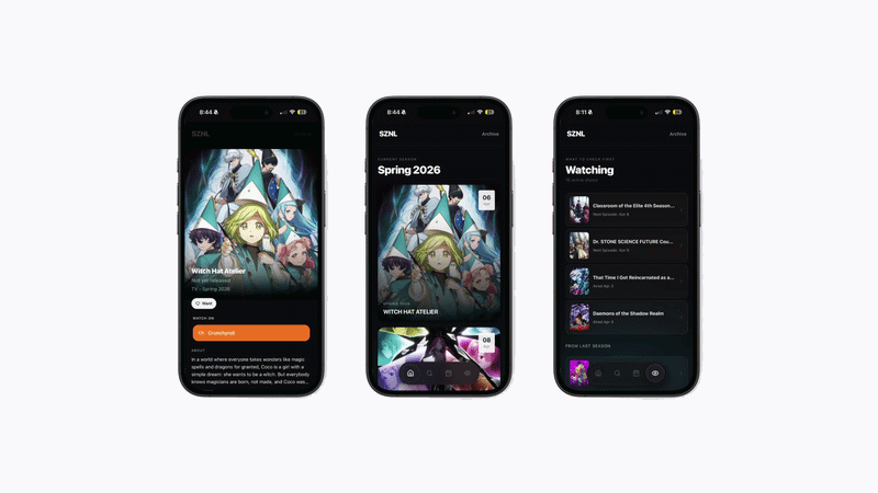
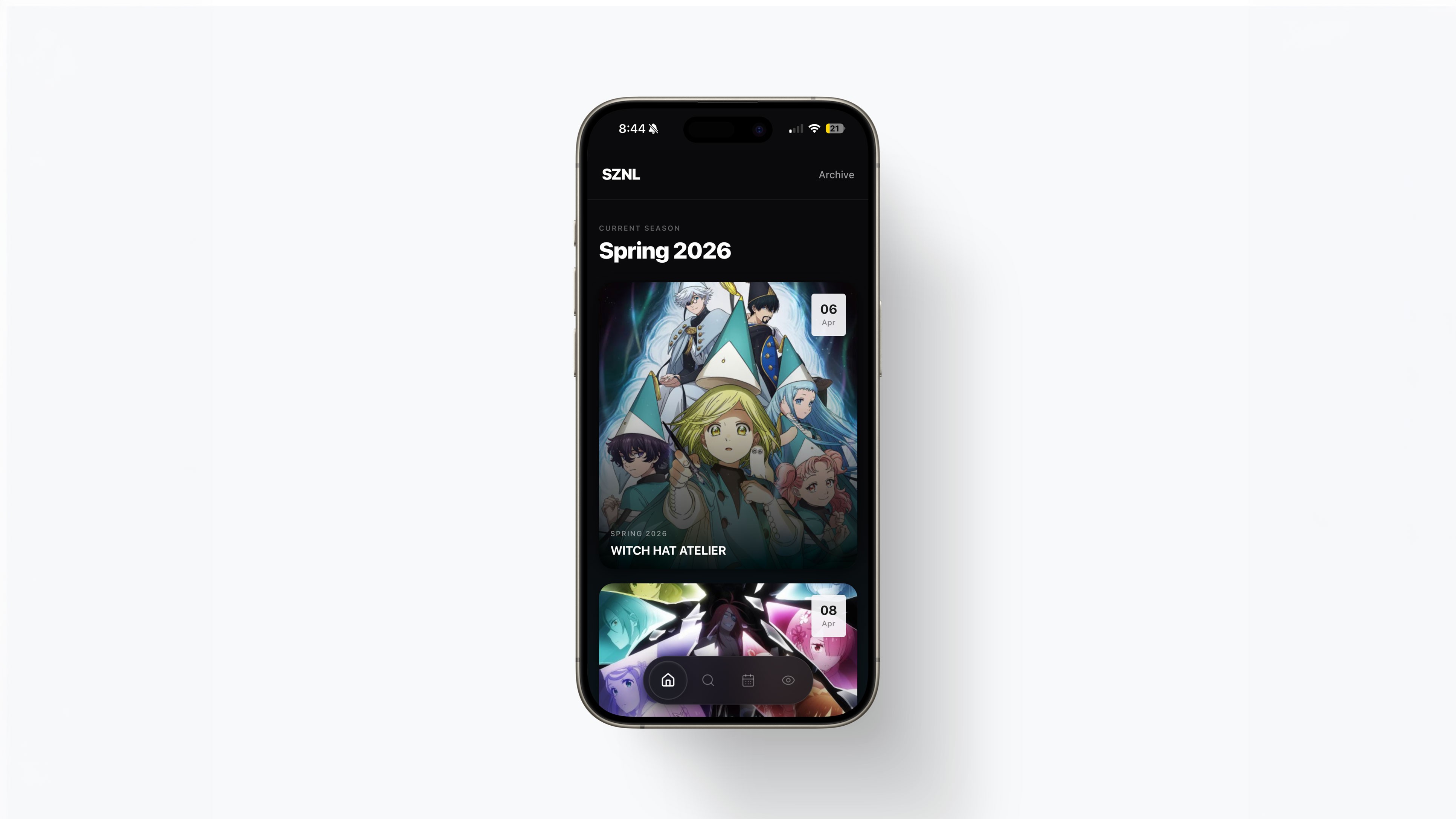
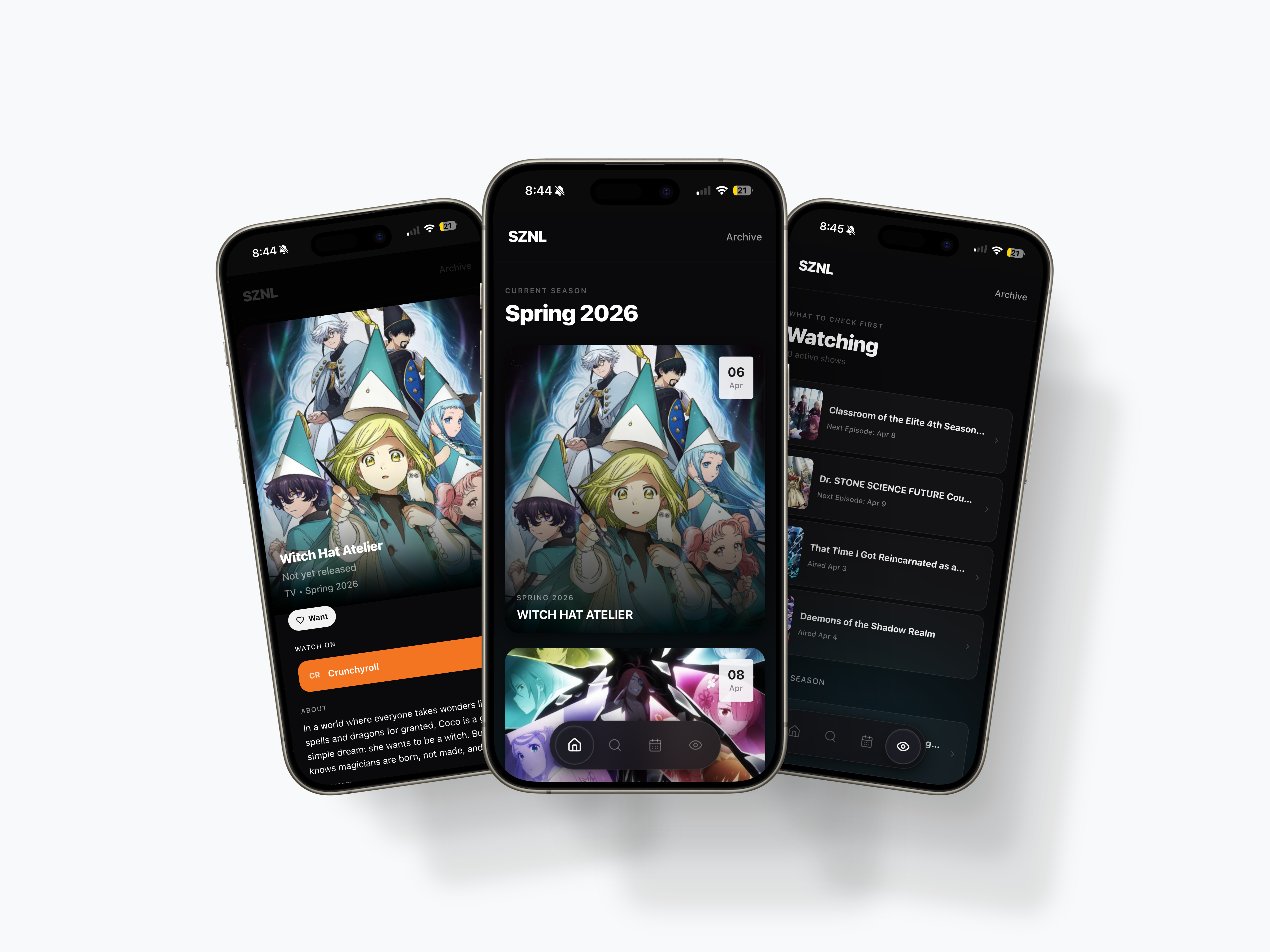
That led to one simple principle. The current season should always be the focus.
Not your profile, not your stats, and not your history. Just what’s happening right now. Once that clicked, everything else started to fall into place.
I simplified way more than I expected
I didn’t start listing features. I started removing friction.
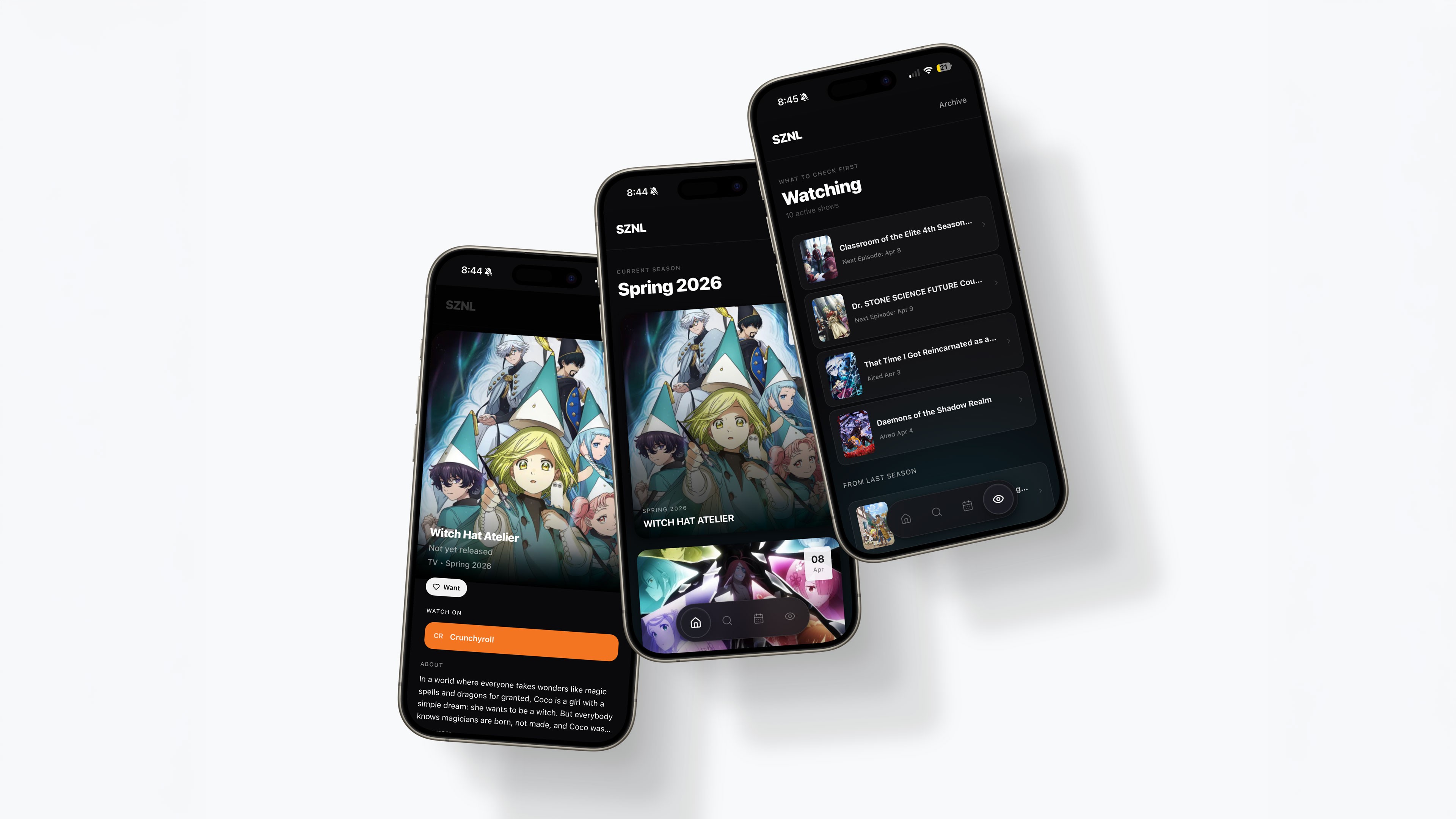
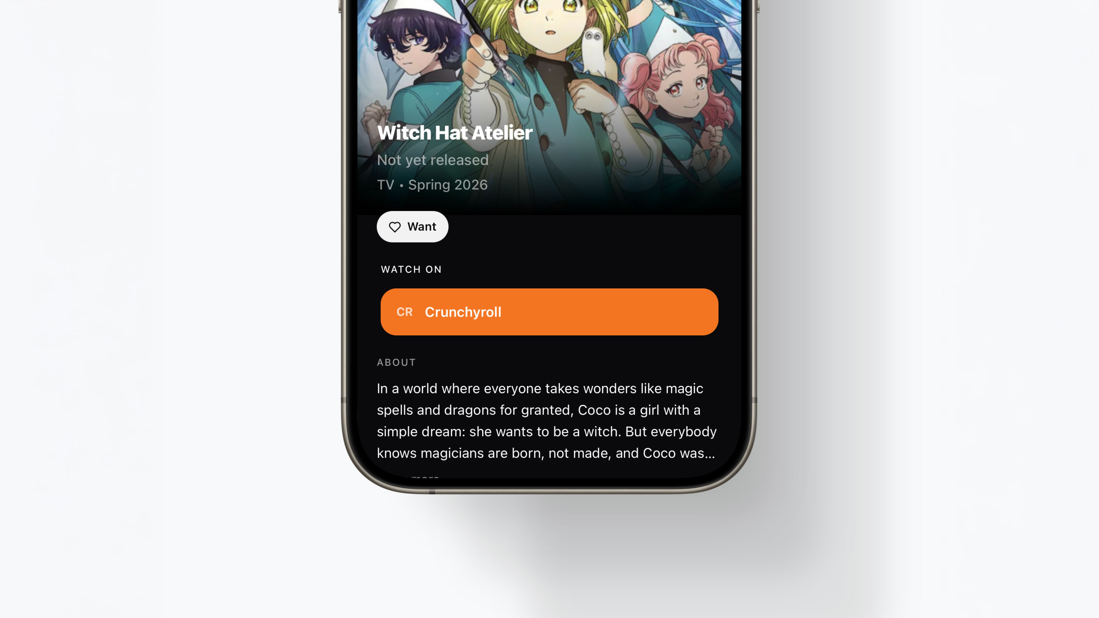
If the current season matters most, then the Home experience should only show the current season. If a show is still airing, it shouldn’t reset or disappear. It should just carry over automatically. If I’m deciding what to watch, I don’t care about episode numbers. I care about when the next episode drops. And if I’m trying to watch something, I shouldn’t have to search for where it’s streaming.
Each of these decisions is small on its own, but together they completely change how the product feels.
The part that actually got hard
Most trackers come with a ton of states. Watching, completed, dropped, planned, paused. It’s a lot.
I cut that down to three. Want, Watching, and Finished. That’s it.
Same thing with features. I didn’t add ratings, reviews, or social layers. Not because they’re bad ideas, but because they don’t help me answer the question I actually care about. What should I watch right now.
The goal wasn’t to build a better version of existing tools. It was to make something that feels effortless during a season.
Building it changed how I think
Some of the hardest problems weren’t visual. They were product problems.
What happens when you leave the app to open Crunchyroll and come back? On paper it sounds simple, but mobile doesn’t behave the way your Figma flows do. You lose state, you come back to weird screens, and things don’t feel reliable.
I had to think through session handling, deep linking, and how people actually move between apps. This is the kind of stuff you don’t really run into unless you’re building the thing yourself.
At the same time, I had to constantly fight the urge to add more. Ratings, social features, recommendations. All of it makes sense. But all of it pulls the product away from what it’s trying to do.
Where I landed
This wasn’t just a design exercise. I built the whole thing using Base44 and treated prompts like product specs.
Instead of handing things off, I just kept iterating until it worked. Fixing flows, adjusting hierarchy, breaking things, and rebuilding them. It was messy, but it was fast.
More importantly, it forced me to think differently. Less about designing screens and more about how the product actually behaves in the real world.
Made with love in Orange County, CA.
Built in Figma Sites (Beta)
© Selected Works / Eric Sin
2018—2026
SZNL
I built an anime tracker because everything else made this harder than it should be
Most anime trackers are built around what you finished. That never really made sense to me. I’m not opening an app to look at what I watched six months ago.
I built SZNL around what actually matters in the moment. What is airing right now and what I should be watching this week. This ended up becoming a full product exercise where I focused on behavior, stripped things down, and built something that actually fits how I watch anime.
The routine everyone just accepts
Anime drops in seasons. Winter, Spring, Summer, Fall. If you watch seasonal anime, you already know the routine. You open one app, then another, then another. MyAnimeList to see what’s airing, Crunchyroll to check if it’s actually there, Reddit to figure out if it’s worth watching, and sometimes a seasonal chart if you’re really trying to stay organized.
All of that just to answer a few basic questions. What’s airing right now. What should I pick up. When does the next episode drop. Where do I even watch it.
None of this is hard. It just feels like unnecessary work.
The thing that didn’t sit right
The more I used these tools, the more something felt off. They’re all built around completion. You track what you’ve watched, rate it, and build a list that reflects your history.
But that’s not how I use these tools. I’m opening them because I want to know what dropped this week and what I should be watching right now.
Seasonal anime behaves more like live TV than a library. It’s time based and constantly moving. You fall behind, you pick things up mid-season, and you drop shows without thinking about it. But the tools don’t reflect that. They expect you to organize everything manually.
That mismatch is the real problem.
Designing around how people actually watch
Instead of trying to improve an anime tracker, I asked a different question. What would this look like if it actually matched how people watch?
That led to one simple principle. The current season should always be the focus.
Not your profile, not your stats, and not your history. Just what’s happening right now. Once that clicked, everything else started to fall into place.
I simplified way more than I expected
I didn’t start listing features. I started removing friction.
If the current season matters most, then the Home experience should only show the current season. If a show is still airing, it shouldn’t reset or disappear. It should just carry over automatically. If I’m deciding what to watch, I don’t care about episode numbers. I care about when the next episode drops. And if I’m trying to watch something, I shouldn’t have to search for where it’s streaming.
Each of these decisions is small on its own, but together they completely change how the product feels.
The part that actually got hard
Most trackers come with a ton of states. Watching, completed, dropped, planned, paused. It’s a lot.
I cut that down to three. Want, Watching, and Finished. That’s it.
Same thing with features. I didn’t add ratings, reviews, or social layers. Not because they’re bad ideas, but because they don’t help me answer the question I actually care about. What should I watch right now.
The goal wasn’t to build a better version of existing tools. It was to make something that feels effortless during a season.
Building it changed how I think
Some of the hardest problems weren’t visual. They were product problems.
What happens when you leave the app to open Crunchyroll and come back? On paper it sounds simple, but mobile doesn’t behave the way your Figma flows do. You lose state, you come back to weird screens, and things don’t feel reliable.
I had to think through session handling, deep linking, and how people actually move between apps. This is the kind of stuff you don’t really run into unless you’re building the thing yourself.
At the same time, I had to constantly fight the urge to add more. Ratings, social features, recommendations. All of it makes sense. But all of it pulls the product away from what it’s trying to do.
Where I landed
This wasn’t just a design exercise. I built the whole thing using Base44 and treated prompts like product specs.
Instead of handing things off, I just kept iterating until it worked. Fixing flows, adjusting hierarchy, breaking things, and rebuilding them. It was messy, but it was fast.
More importantly, it forced me to think differently. Less about designing screens and more about how the product actually behaves in the real world.
Made with love in Orange County, CA.
Built in Figma Sites (Beta)
© Selected Works / Eric Sin
2018—2026
SZNL
I built an anime tracker because everything else made this harder than it should be
Most anime trackers are built around what you finished. That never really made sense to me. I’m not opening an app to look at what I watched six months ago.
I built SZNL around what actually matters in the moment. What is airing right now and what I should be watching this week. This ended up becoming a full product exercise where I focused on behavior, stripped things down, and built something that actually fits how I watch anime.
The routine everyone just accepts
Anime drops in seasons. Winter, Spring, Summer, Fall. If you watch seasonal anime, you already know the routine. You open one app, then another, then another. MyAnimeList to see what’s airing, Crunchyroll to check if it’s actually there, Reddit to figure out if it’s worth watching, and sometimes a seasonal chart if you’re really trying to stay organized.
All of that just to answer a few basic questions. What’s airing right now. What should I pick up. When does the next episode drop. Where do I even watch it.
None of this is hard. It just feels like unnecessary work.
The thing that didn’t sit right
The more I used these tools, the more something felt off. They’re all built around completion. You track what you’ve watched, rate it, and build a list that reflects your history.
But that’s not how I use these tools. I’m opening them because I want to know what dropped this week and what I should be watching right now.
Seasonal anime behaves more like live TV than a library. It’s time based and constantly moving. You fall behind, you pick things up mid-season, and you drop shows without thinking about it. But the tools don’t reflect that. They expect you to organize everything manually.
That mismatch is the real problem.
Designing around how people actually watch
I didn’t start listing features. I started removing friction.
If the current season matters most, then the Home experience should only show the current season. If a show is still airing, it shouldn’t reset or disappear. It should just carry over automatically. If I’m deciding what to watch, I don’t care about episode numbers. I care about when the next episode drops. And if I’m trying to watch something, I shouldn’t have to search for where it’s streaming.
Each of these decisions is small on its own, but together they completely change how the product feels.
I simplified way more than I expected
Most trackers come with a ton of states. Watching, completed, dropped, planned, paused. It’s a lot.
I cut that down to three. Want, Watching, and Finished. That’s it.
Same thing with features. I didn’t add ratings, reviews, or social layers. Not because they’re bad ideas, but because they don’t help me answer the question I actually care about. What should I watch right now.
The goal wasn’t to build a better version of existing tools. It was to make something that feels effortless during a season.
The part that actually got hard
Some of the hardest problems weren’t visual. They were product problems.
What happens when you leave the app to open Crunchyroll and come back? On paper it sounds simple, but mobile doesn’t behave the way your Figma flows do. You lose state, you come back to weird screens, and things don’t feel reliable.
I had to think through session handling, deep linking, and how people actually move between apps. This is the kind of stuff you don’t really run into unless you’re building the thing yourself.
At the same time, I had to constantly fight the urge to add more. Ratings, social features, recommendations. All of it makes sense. But all of it pulls the product away from what it’s trying to do.
Building it changed how I think
This wasn’t just a design exercise. I built the whole thing using Base44 and treated prompts like product specs.
Instead of handing things off, I just kept iterating until it worked. Fixing flows, adjusting hierarchy, breaking things, and rebuilding them. It was messy, but it was fast.
More importantly, it forced me to think differently. Less about designing screens and more about how the product actually behaves in the real world.
Where I landed
At the end of it, I had something simple. A way to see what’s airing right now, track what I’m watching, know when episodes drop, and jump straight into watching.
No extra work. No overthinking. Just something that fits how I actually watch.
And more than anything, it reinforced something I keep coming back to. Good product design isn’t about adding more. It’s about making things feel obvious.
Made with love in Orange County, CA.
Built in Figma Sites (Beta)
© Selected Works / Eric Sin
2018—2026