
We removed sign up friction so users could jump straight into free content.
Engagement went up. Trial starts dropped 40%. I built and tested a system of upsell moments inside the product that clarified premium value without breaking the free experience. It recovered conversion by fixing understanding, not forcing upgrades.
We Fixed Friction… and Broke Conversion
We made a big bet. Let users watch FAST content without signing up first. On paper, it made sense. Less friction, more engagement, easier entry into the product. And it worked… kind of. People came in. They watched. They stayed. But trial starts dropped 40%. We didn’t lose users. We lost intent.

What Actually Changed
Before this, signing up was a signal. If someone created an account, they wanted something. There was already intent baked into the flow. Once we removed that gate, we got a completely different user. They weren’t trying to subscribe. They were just exploring. And we treated them the same. That was the mistake.
My Role
Users weren’t converting because they didn’t understand what they were missing. They stayed in FAST because: They weren’t seeing premium content clearly They didn’t understand what “Core” actually gave them Upgrade moments felt random or interruptive Nothing in the experience naturally pushed them to ask: “Wait… what do I get if I upgrade?” So they never left free.
Starting With a Simple Hypothesis
I owned figuring out how to fix this without undoing the whole freemium shift. Not just designing an upsell. Designing when it shows up, where it lives, and how it fits into the product. That meant:
- Defining upgrade entry points inside FAST
- Working with Growth on test strategy
- Partnering with research on messaging
- Sequencing experiments from fast to heavy lift
This wasn’t about pushing harder. It was about being smarter.
Three Ways to Test It
We didn’t assume users didn’t want to pay. We assumed they didn’t get it.
So the hypothesis was simple:
If we clearly show the difference between free and paid, users will convert.
Not through pressure. Through clarity.
Messaging Was the Real Lever
Instead of overbuilding, we tested three approaches with different levels of effort.
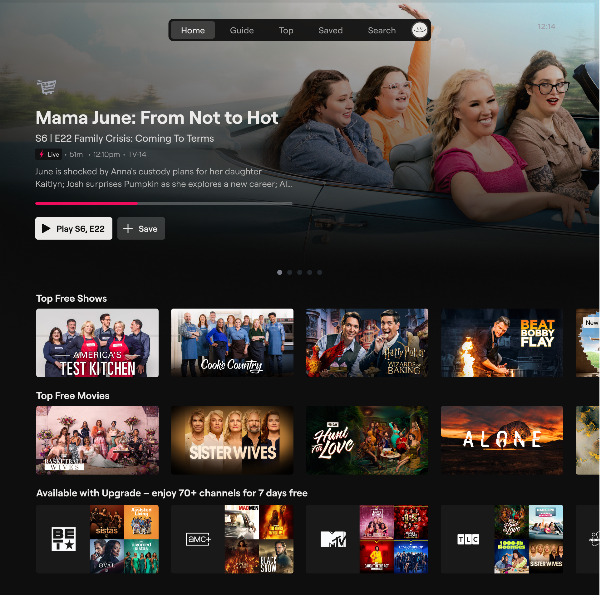
In Row
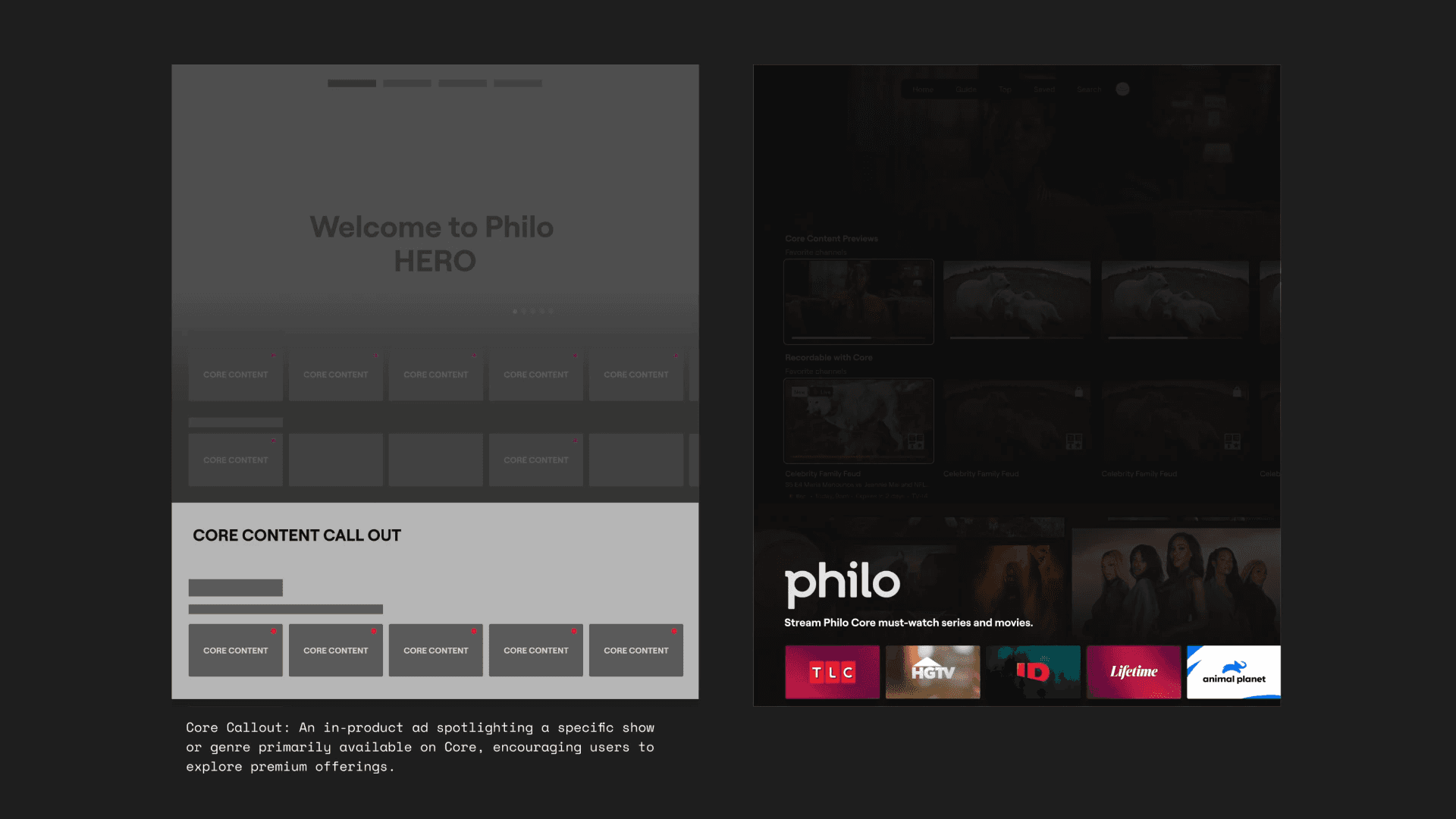
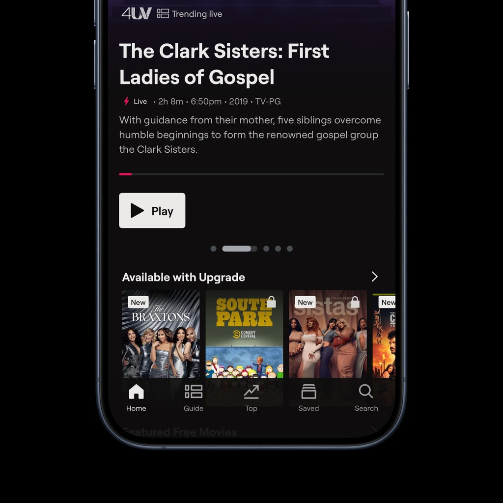
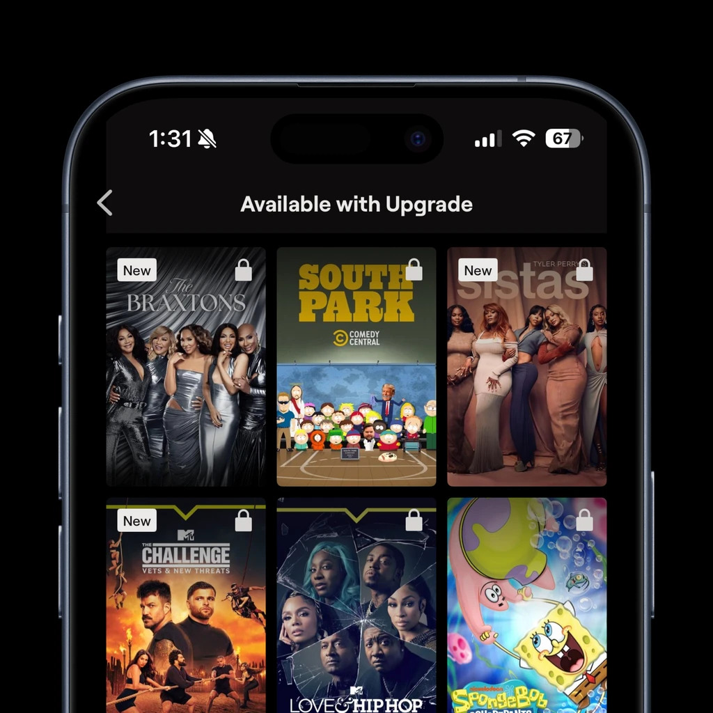
A simple content row showing premium content with a strong headline. Fast to ship, low risk.
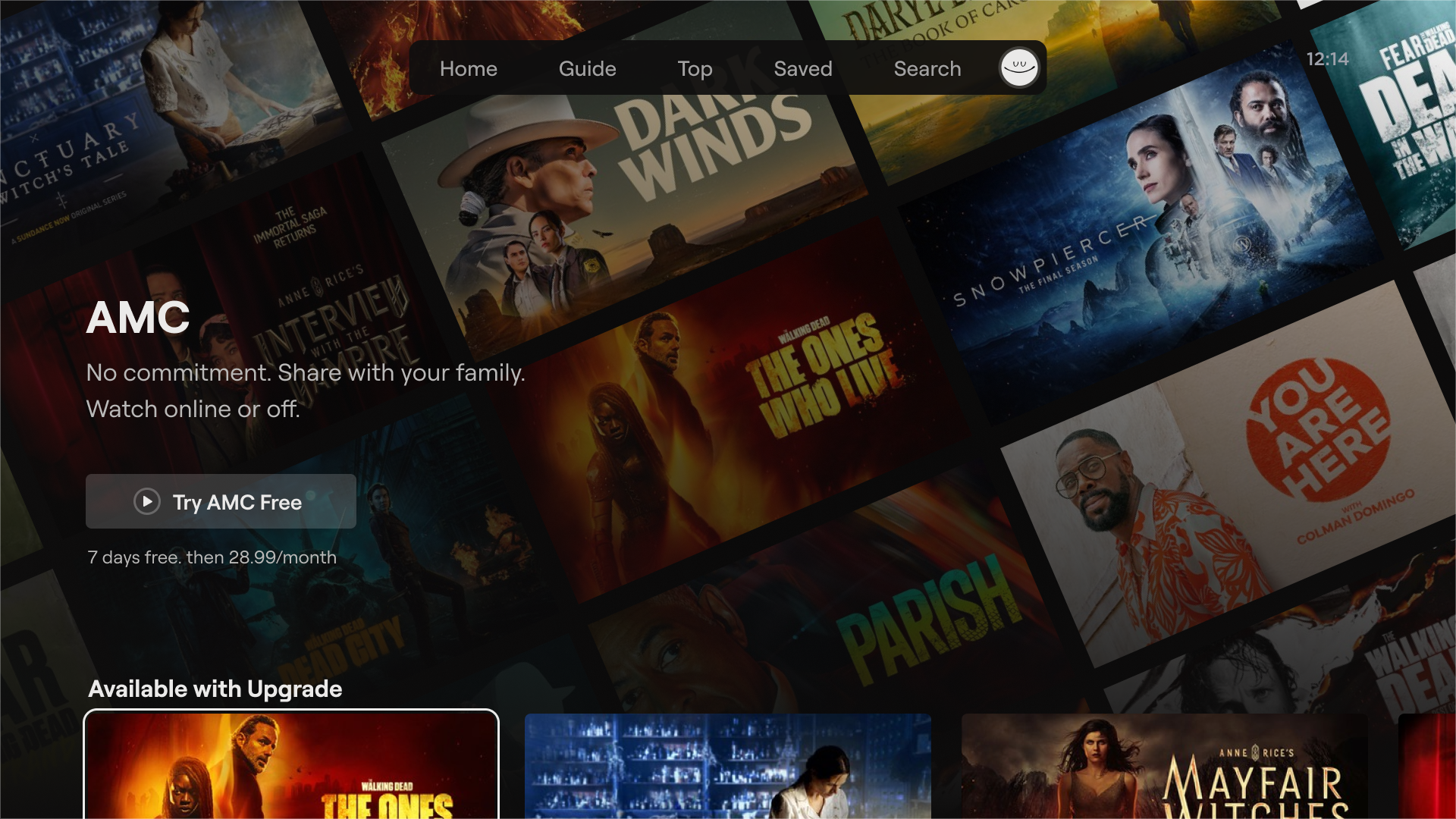
Home Hero
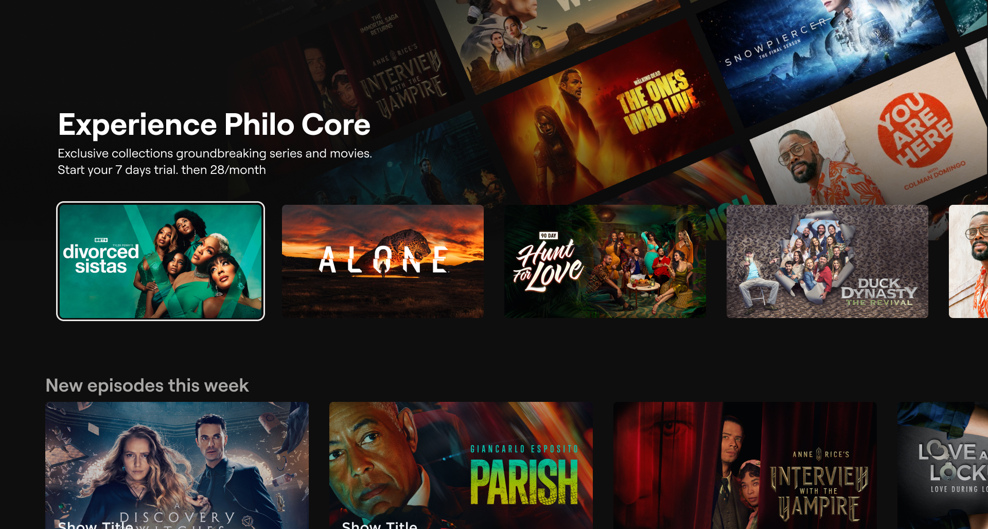
A high visibility placement with more room to explain value. Higher impact, but risk of confusing the free experience.
Promotional Wrapper
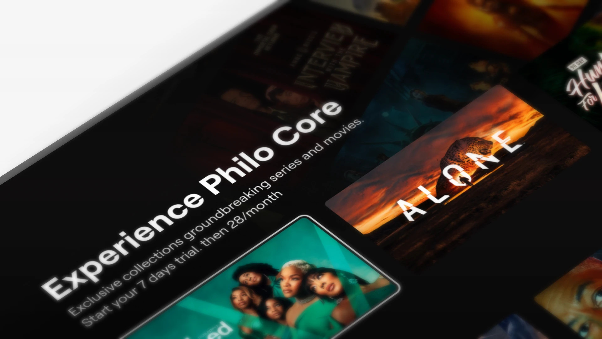
A bigger, more expressive version of a row that could fully tell the story.
Most compelling, but required building something new.
We didn’t pick one. We sequenced them.
What Worked (and What Didn’t)
Before placement, we tested language. Because if the message doesn’t land, nothing else matters. What worked:
“Upgrade for Full Access to 70+ Premium Channels – Try 7 Days Free”
It was clear, specific, and low risk.
Not “Philo Core.” Not “Premium Networks.”
Just straight up:
Here’s what you get. Here’s how many. You can try it.
That clarity mattered more than any layout decision.
Made with love in Orange County, CA.
Built in Figma Sites (Beta)
© Selected Works / Eric Sin
2018—2026
Upselling FAST Users
Removing sign up friction increased engagement but dropped trial starts 40%. I designed upsell moments that made premium value clear and brought conversion back.
We removed sign up friction so users could jump straight into free content.
Engagement went up. Trial starts dropped 40%. I built and tested a system of upsell moments inside the product that clarified premium value without breaking the free experience. It recovered conversion by fixing understanding, not forcing upgrades.
We Fixed Friction… and Broke Conversion
We made a big bet. Let users watch FAST content without signing up first. On paper, it made sense. Less friction, more engagement, easier entry into the product. And it worked… kind of. People came in. They watched. They stayed. But trial starts dropped 40%. We didn’t lose users. We lost intent.
What Actually Changed
Before this, signing up was a signal. If someone created an account, they wanted something. There was already intent baked into the flow. Once we removed that gate, we got a completely different user. They weren’t trying to subscribe. They were just exploring. And we treated them the same. That was the mistake.
My Role
Users weren’t converting because they didn’t understand what they were missing. They stayed in FAST because: They weren’t seeing premium content clearly They didn’t understand what “Core” actually gave them Upgrade moments felt random or interruptive Nothing in the experience naturally pushed them to ask: “Wait… what do I get if I upgrade?” So they never left free.
Starting With a Simple Hypothesis
I owned figuring out how to fix this without undoing the whole freemium shift. Not just designing an upsell. Designing when it shows up, where it lives, and how it fits into the product. That meant:
- Defining upgrade entry points inside FAST
- Working with Growth on test strategy
- Partnering with research on messaging
- Sequencing experiments from fast to heavy lift
This wasn’t about pushing harder. It was about being smarter.
Three Ways to Test It
We didn’t assume users didn’t want to pay. We assumed they didn’t get it.
So the hypothesis was simple:
If we clearly show the difference between free and paid, users will convert.
Not through pressure. Through clarity.
Messaging Was the Real Lever
Instead of overbuilding, we tested three approaches with different levels of effort.
In Row
A simple content row showing premium content with a strong headline. Fast to ship, low risk.
Home Hero
A high visibility placement with more room to explain value. Higher impact, but risk of confusing the free experience.
Promotional Wrapper
A bigger, more expressive version of a row that could fully tell the story.
Most compelling, but required building something new.
We didn’t pick one. We sequenced them.
What Worked (and What Didn’t)
Before placement, we tested language. Because if the message doesn’t land, nothing else matters. What worked:
“Upgrade for Full Access to 70+ Premium Channels – Try 7 Days Free”
It was clear, specific, and low risk.
Not “Philo Core.” Not “Premium Networks.”
Just straight up:
Here’s what you get. Here’s how many. You can try it.
That clarity mattered more than any layout decision.
Made with love in Orange County, CA.
Built in Figma Sites (Beta)
© Selected Works / Eric Sin
2018—2026
Upselling FAST Users
Removing sign up friction increased engagement but dropped trial starts 40%. I designed upsell moments that made premium value clear and brought conversion back.
We removed sign up friction so users could jump straight into free content.
Engagement went up. Trial starts dropped 40%. I built and tested a system of upsell moments inside the product that clarified premium value without breaking the free experience. It recovered conversion by fixing understanding, not forcing upgrades.
We Fixed Friction… and Broke Conversion
We made a big bet. Let users watch FAST content without signing up first. On paper, it made sense. Less friction, more engagement, easier entry into the product. And it worked… kind of. People came in. They watched. They stayed. But trial starts dropped 40%. We didn’t lose users. We lost intent.
What Actually Changed
Before this, signing up was a signal. If someone created an account, they wanted something. There was already intent baked into the flow. Once we removed that gate, we got a completely different user. They weren’t trying to subscribe. They were just exploring. And we treated them the same. That was the mistake.
My Role
I owned figuring out how to fix this without undoing the whole freemium shift. Not just designing an upsell. Designing when it shows up, where it lives, and how it fits into the product. That meant:
- Defining upgrade entry points inside FAST
- Working with Growth on test strategy
- Partnering with research on messaging
- Sequencing experiments from fast to heavy lift
This wasn’t about pushing harder. It was about being smarter.
Starting With a Simple Hypothesis
We didn’t assume users didn’t want to pay. We assumed they didn’t get it.
So the hypothesis was simple:
If we clearly show the difference between free and paid, users will convert.
Not through pressure. Through clarity.
Three Ways to Test It
Instead of overbuilding, we tested three approaches with different levels of effort.
In Row
A simple content row showing premium content with a strong headline. Fast to ship, low risk.
Home Hero
A high visibility placement with more room to explain value. Higher impact, but risk of confusing the free experience.
Promotional Wrapper
A bigger, more expressive version of a row that could fully tell the story.
Most compelling, but required building something new.
We didn’t pick one. We sequenced them.
Messaging Was the Real Lever
Before placement, we tested language. Because if the message doesn’t land, nothing else matters. What worked:
“Upgrade for Full Access to 70+ Premium Channels – Try 7 Days Free”
It was clear, specific, and low risk.
Not “Philo Core.” Not “Premium Networks.”
Just straight up:
Here’s what you get. Here’s how many. You can try it.
That clarity mattered more than any layout decision.
What Worked (and What Didn’t)
The In Row test proved the concept.
Users noticed it. They clicked. Conversion improved.
But it had limits. One line of text can only do so much.
Home Hero gave us more room to explain.
Better context. Stronger visuals. Clearer CTA.
That’s where things started to click.
The big takeaway:
Placement matters, but context matters more.
If users understand what they’re getting, they’ll move.
Made with love in Orange County, CA.
Built in Figma Sites (Beta)
© Selected Works / Eric Sin
2018—2026