Redesigning Philo.com

Philo's landing page is the first interaction a user has with Philo—not only is it the beginning of their journey within the platform, it's also a point of validation. When a user's first impression is less than positive, it automatically deters them from wanting to move forward. 

View Case Study

Philo's landing page is the first interaction a user has with Philo—not only is it the beginning of their journey within the platform, it's also a point of validation. When a user's first impression is less than positive, it automatically deters them from wanting to move forward. 

View Case Study

Philo's landing page is the first interaction a user has with Philo—not only is it the beginning of their journey within the platform, it's also a point of validation. When a user's first impression is less than positive, it automatically deters them from wanting to move forward. 

View Case Study

About

My Role: Lead Product Designer
Timeline: 8 Weeks

The Problem to Solve

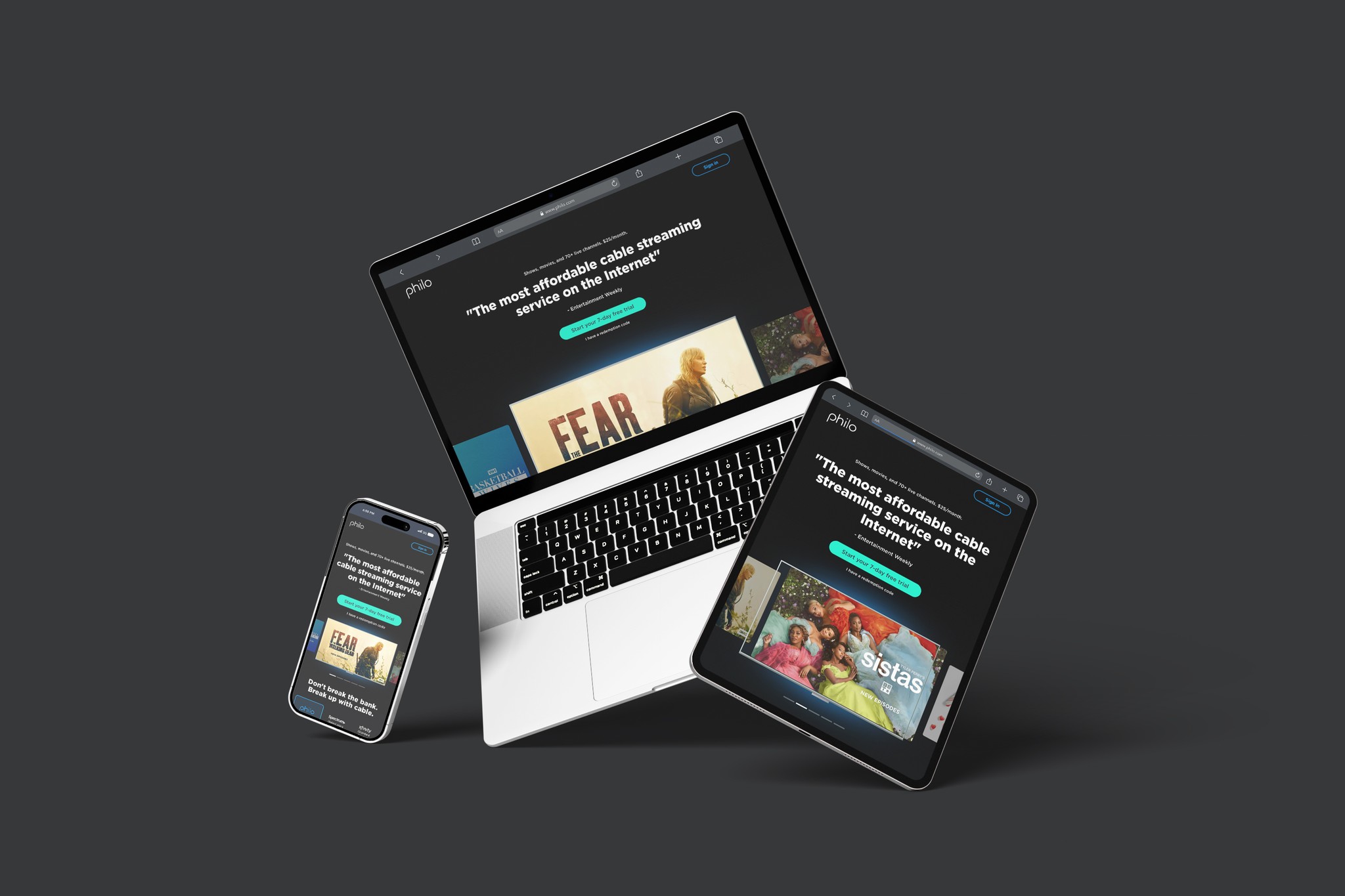
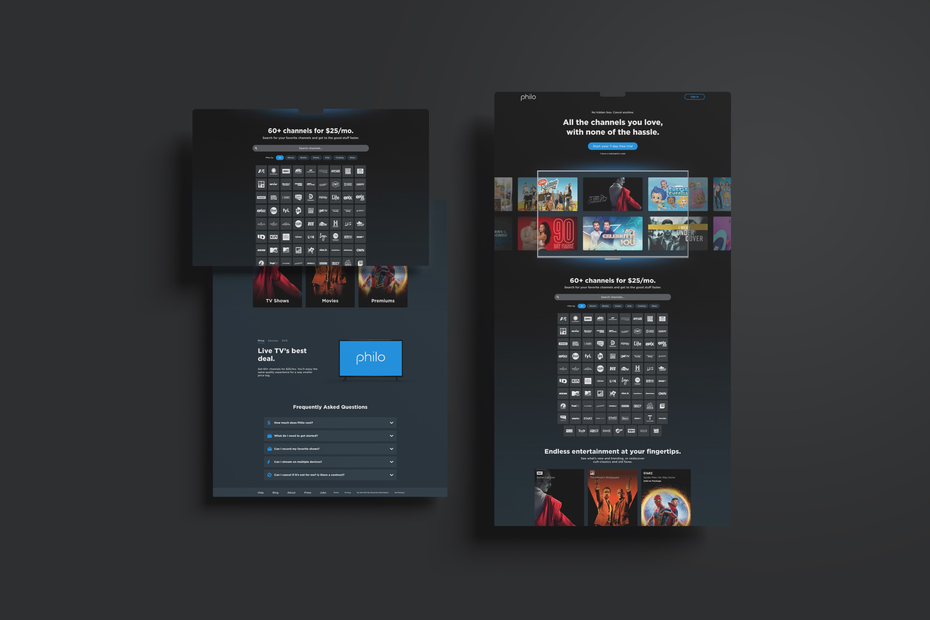
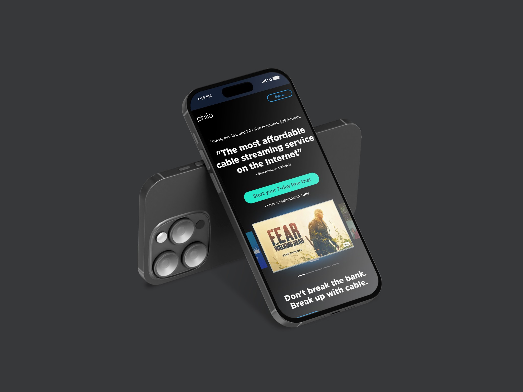
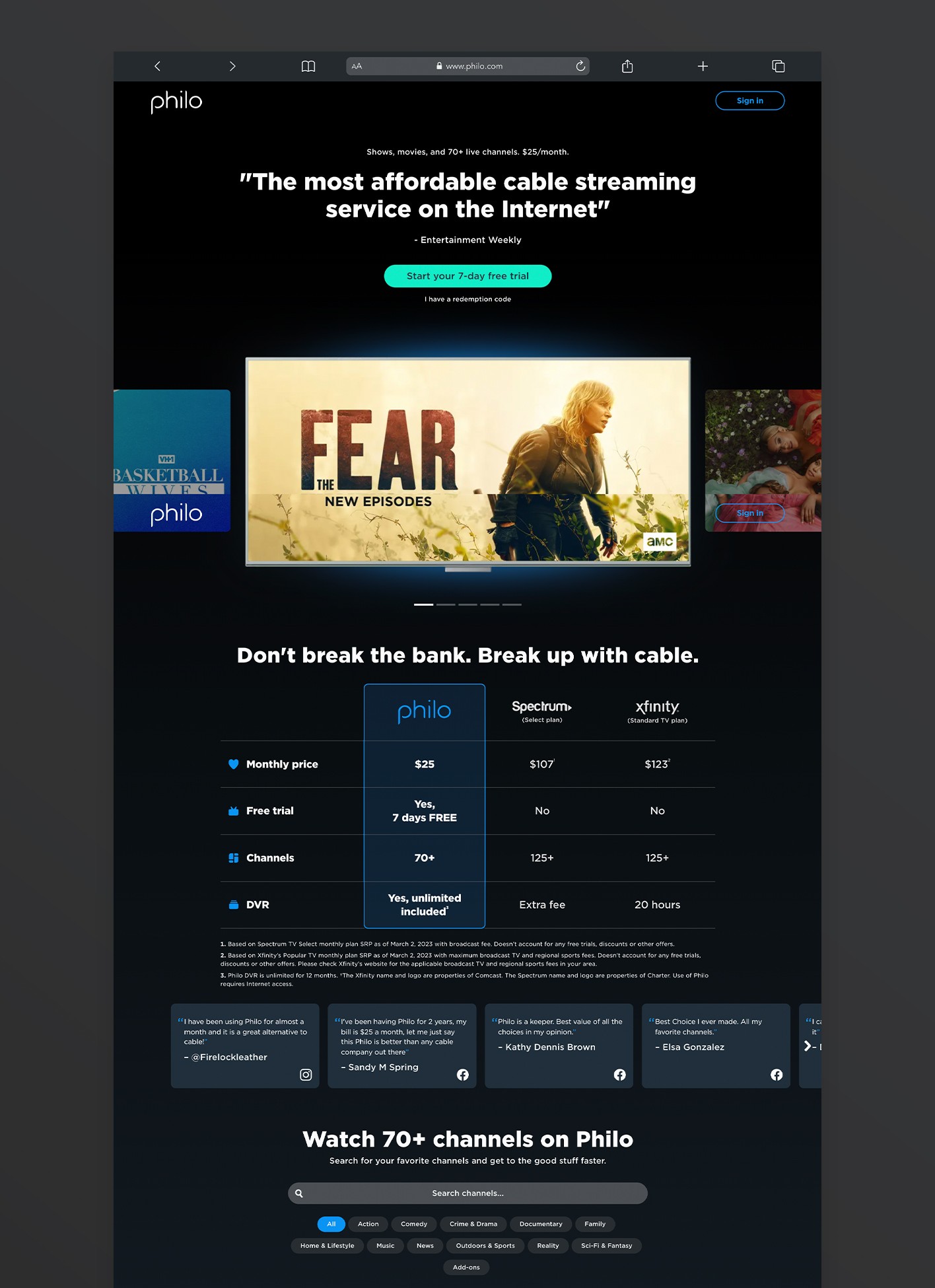
The issue is with Philo's initial page, which fails to make a strong impression and leads to high user departure despite sign-ups. Previous minor adjustments were ineffective, prompting a focus on more substantial changes. We're exploring three approaches: emphasizing Philo's capabilities, providing user guidance, and showcasing its top content.

Our Solution

The strategy aimed to elevate Philo's brand with a cohesive ecosystem and a cinematic color palette, presenting it as accessible and professional. Results: a 6.2% increase in initial payments, a 5.0% rise in subscribers, and a 5.7% boost in sign-ups. The test outperformed, with a remarkable 99.9% win over the control group.

LIVE DESIGN

Let’s talk!

williams.tamone@gmail.com